Original warm
Navy on warm paper. The default for APCORE materials.
Download original warm SVGAPCORE identity
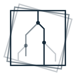
Our mark brings together a stable frame and branching paths: focused inquiry, alternative possibilities, and decisions made under uncertainty.
01 / Meaning
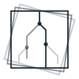
The upright square gives the mark a stable center. Two lighter, rotated frames suggest motion as evidence and perspectives change. Their open interiors leave room for exploration.
Angular branches represent possible directions of inquiry. Shorter alternatives end as the search narrows; one meets a rotated frame, connecting exploration with the focus around it. Each alternative shares its frame’s opacity.
Circles mark decision points. The strongest path runs from the upper edge to the lower edge of the upright frame, expressing a decision pursued through the analysis. The lighter paths remain visible as possibilities considered along the way.
02 / Color variants
Choose the artwork for its intended background. The outlined decision circles in the full mark use that background color.
Navy on warm paper. The default for APCORE materials.
Download original warm SVG
Navy on white. For documents and white backgrounds.
Download white SVG
Warm paper on navy. For dark backgrounds.
Download inverse SVG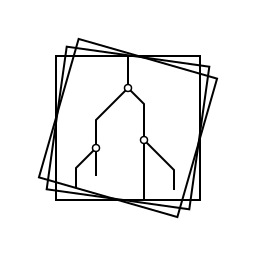
Black on white. For monochrome reproduction.
Download solid black SVG03 / Usage & assets
Use the profile that fits the displayed size. At smaller sizes, filled decision circles and stronger lines keep the structure legible.
128 px and above
Outlined decision circles and the original fine strokes. Use for larger placements.
48–127 px
Filled circles, stronger strokes, and tighter framing. Used in our website header and footer.

16–47 px
Larger filled circles and stronger contrast for icons. Fine branching detail becomes a visual hint.
Use the SVG files directly and preserve their square proportions. Set the display size explicitly. Avoid blur filters, shadows, stretching, and enlarged bitmap exports.
Keep surrounding text and graphics at least one eighth of the displayed canvas width away from the artwork. Place it on a plain background that matches the chosen variant.
Keep the frame rotations, path lengths, decision circles, and relative contrast as supplied. For a single-color reproduction, use the solid-black variant.
Download logo assets — SVG package
All three size profiles in four color variants, with a usage guide.